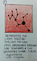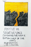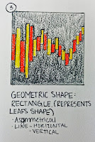


This project taught me a lot. It taught me the meaning of a nature object and how much we have incorporated it into our design today. I chose a leaf as my nature object to represent the designer I chose, Cynthia Leibrock. She mainly designs for disabled and elderly people. My favorite quote of hers which I believe represents her design process the best is:
"I want people to know no matter
whether they have mental or physical disabilities-change that word to differences-
they are only disabled if they can't do what they want to do. Architecture can
eliminate disability by design. You see my point, if you are in a house,
where you can do what you want to do, you're not disabled
anymore."-Cynthia Leibrock
She is a great designer that is very practical, functional, energy efficient and uses technology at its finest within her designs.
The three images on the right are different abstractions I have made to represent her and her work as a designer, I am very happy with my final three.
The abstraction process of the leaf I found very difficult at first. After I started to get my ideas flowing by interpreting the different details of the leaf I was able to think outside the box zooming in and out on the leaf to create the different abstractions. In doing so I found myself focusing on positive and negative space, geometric shapes such as circles and rectangles and horizontal, vertical and diagonal lines.
Mind Map:
Study Models:
These are the study models I made for my first round of models. My inspiration was a leaf in which I thought represented Cynthia Leibrock. From here I will refine these models into one model creation with a shelter and bench as its purpose.
Revised Study Models:


Final Concept Model:
After a long process of creating abstract drawings, than abstract three dimensional models, and refining them I finally came up with my final concept model. This model will eventually be used as a seat and shelter for people for a project I am working on. The bench and shelter are additions coming so there will be a later post on that I just wanted to show my work at this stage. So far I really like the contemporary abstract look it has to offer as its metal shines/ reflects off of the figure. Also I like how the curvature of the rectangles create a rhythm up and over the structure. I am very pleased with where my abstractions have taken me and I can't wait to have a final finished product.
Final Model:
After all of the two dimensional and three dimensional abstractions, my final model evolved. This model is meant to provide a seat and shelter for people, as you can see through the different views. The left view shows you how the outer bench is sheltered by the curvature of the rectangles that go at a curved/diagonal angle. The center view shows the outer bench straight on and how it would be sheltered from the sun above it and to the left of it. The last view I have provided is the right view showing the outer bench again, and the inside shelter and bench for the first time.
My
designer, Cynthia Leibrock, inspired this whole project designed for elderly
and disabled people, which is why I decided to provide another bench.
Elderly or disabled people have trouble standing or standing for a while, by
providing a second bench I am able to make sure that if the bench outside was
for some reason full or not suitable for sitting on, they could sit along the
bench in the shelter.
While
designing this model I thought of the materials and colors I would use, and how
they would represent my designer. First I decided the curved
rectangles that act as the roof would be made of silver metal. By making
this shelter metal, I was able to represent contemporary/ clean cut designs, as
well as give my structure a high technology/ sophisticated look, as she does in
many of her designs. Next, I chose to use concrete to make up the
structures actual shape. I chose concrete because it can be manipulated
into so many shapes, it doesn't get overly hot in the sun, and still gave my
structure the contemporary look I was going for. Last, I chose to make
the benches out of a red wood. I chose the red wood because it doesn't get
too hot if exposed to the sun, is sustainable and provides emphasis through the
red color to communicate to people that they can sit here.
I am
very pleased with the outcome of my design and could see it virtually in any
climate. If I had to pick a designated place for my seat and shelter
model I would chose for it to be in the city because the contemporary look
attracts people and would blend into the city atmosphere better than that of a
farming one.
The process
of building all the models allowed my to see what ideas worked and which
didn't. It also allowed me to learn what materials work for this
structure and what ones don't. I really enjoyed this project because I
realized this is going to be a big part of my career, as I turn things I
visualize into real three dimensional structures.
Project D Complete!
Left/Front view
Right view


After a long process I have finally completed my seat and shelter model! My favorite picture of this project by far is the top picture, in which it displays all of my work over the course of this project, showing the 2-dimensional and 3-dimensional abstractions, all of my step by step work in the packet and binder as well as my concept and final model, and the process throughout the three boards. I have learned so much from this project from scanning in my hand drafted lettering and making the background transparent, to scanning in my drafted seat and shelter images and enhancing them digitally. My favorite part of my learning experience was definitely learning how to scan in my hand drafted images and enhancing them through Photoshop. By doing this I was able to make them crisp and clear turning them instantly into images that looked one hundred percent more professional, and is a technique I will use in every project I do from here on out. This project has inspired me for my design career, as it taught me the step by step process of creating a space and the requirements of each step. I can't wait to design a space like this that people can use!


No comments:
Post a Comment